Pricing Page Best Practices: Structure, Anchoring, and Reducing Hesitation
The pricing page is where buyers decide. Learn how to structure tiers, anchor value, handle ‘contact us’, and reduce hesitation on SaaS and lead-gen pages.
Table of Contents
The pricing page is where the buying decision happens. It’s the page with the highest intent of any page on a site — visitors who reach it have already decided they want what you offer. The question they’re answering on the pricing page is not “should I buy this?” It’s “can I justify this purchase and do the terms feel right for my situation?” The job of the pricing page is to make yes easy to arrive at.
Most pricing pages fail this job in one of two ways: they’re too complicated (so the buyer can’t figure out what they’d actually pay) or they’re too vague (so the buyer can’t tell if the offer is right for their size or budget). Good pricing page design eliminates both problems.
The Short Version
- Three tiers is the standard structure — the middle tier is what most buyers choose, and the top tier exists to anchor it as reasonable value.
- “Contact Us” on every tier signals hidden or high pricing — publish starting-from prices below enterprise and reserve “Contact Us” for genuine custom tiers.
- Every buyer who reaches pricing but doesn’t convert has an unaddressed hesitation — fit, cancellation, hidden costs, or risk if it doesn’t work out.
- Surprise fees revealed at checkout, not on the pricing page, are the single highest-friction moment in a SaaS purchase flow.
Pricing tiers and anchoring
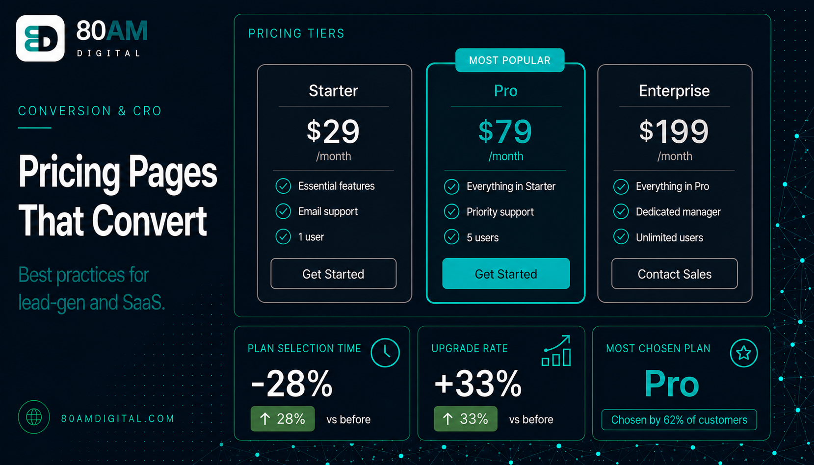
Three tiers is the most common and most effective structure for SaaS and service pricing pages. The reason: the middle tier is chosen by most buyers, and the high tier exists primarily to make the middle tier feel like reasonable value by comparison (price anchoring). The low tier exists to attract buyers who aren’t ready to commit to the full product and to create an upgrade path.
Naming matters. “Starter / Professional / Enterprise” is clear; “Seed / Sapling / Forest” is clever but adds cognitive load. “Most Popular” or “Best Value” badges on the middle tier draw attention to the recommended option and reduce the decision effort for buyers who don’t want to evaluate all three in detail. Make the recommended tier visually distinct — a coloured border, a slightly larger card, or a highlighted header.
Feature lists should clarify what the visitor actually gets, not just what they don’t get at a lower tier. Long lists of crossed-out features on the lower tier signal what’s being withheld rather than what’s being offered — this can make the lower tier feel punitive. Focus each tier’s feature list on what the visitor at that tier level actually needs, stated positively.
Handling “contact us” pricing
Enterprise tiers with “Contact Us” pricing are common for good reasons — pricing is genuinely custom, or it’s strategically withheld to force a sales conversation. The problem: “Contact Us” on every tier, or used as the only option on a pricing page, signals to the visitor that the price is either unclear or high enough to require negotiation. For buyers who want to self-serve and make a decision without a sales call, this is friction that sends them to a competitor with transparent pricing.
The compromise: publish pricing or starting-from prices for the tiers below enterprise, and use “Contact Us” only for the top tier or for a genuine custom tier. A page that says “from £1,200/month, contact us for a tailored quote” gives the buyer a frame of reference without requiring a call just to understand the ballpark.
Reducing hesitation on pricing pages
Every buyer who reaches the pricing page but doesn’t convert has a hesitation that wasn’t addressed. The most common hesitations and how to handle them:
| Hesitation | How to handle it |
|---|---|
| “Is this the right tier for me?” | One-line “who it’s for” under each tier name, plus a “which plan?” FAQ |
| “What happens if I need to cancel?” | State cancellation terms visibly, near the CTA |
| “Are there hidden costs?” | Disclose setup fees, per-seat costs, overages on the page itself |
| “What if it doesn’t work for us?” | Surface trial/guarantee/pilot near the CTA, not buried in FAQs |
- “Is this the right option for my situation?” — Add a brief description of who each tier is for (“For growing teams with 5–20 users” rather than just a feature list). Or add an explicit FAQ: “Which plan should I choose?”
- “What happens if I need to cancel?” — Address cancellation terms visibly, near the CTA. “No long-term contracts. Cancel any time.” or “Annual plans, with a 30-day money-back guarantee.” The presence of this information signals fair dealing; its absence signals you’re hiding unfavourable terms.
- “Is the price what it says it is, or are there hidden costs?” — State what’s included and what costs extra. If setup fees, per-seat pricing, or usage overages exist, disclose them on the pricing page rather than surfacing them at the billing step — surprise fees at checkout are the single highest-friction moment in a SaaS purchase flow.
- “What if it doesn’t work for us?” — A free trial, a money-back guarantee, or a pilot option directly addresses purchase risk. If you offer any of these, they belong on the pricing page, near the CTA — not buried in the FAQs.
For what’s stopping conversions more broadly, see traffic but no conversions. For the social proof that should sit near your pricing CTA, see social proof that actually converts.
The three questions a pricing page must answer
What’s left unanswered shows up as lost conversions
A worked example: from confusing to clear
A project management SaaS had four tiers named “Lite,” “Plus,” “Pro,” and “Enterprise,” with feature lists that overlapped heavily and “Contact Us” pricing on Pro and Enterprise alike. Self-serve signup conversion from the pricing page sat at 2.3%, and support logged a steady stream of pre-sales questions asking what Pro actually cost.
The team consolidated to three tiers (Starter, Professional, Enterprise), published a starting price for Professional, reserved “Contact Us” for Enterprise only, added a one-line “who it’s for” under each tier name, and added a cancellation-terms line directly beneath the Professional CTA. No pricing itself changed — only structure and disclosure. Within six weeks, self-serve conversion from the pricing page rose to 4.1%, and pre-sales pricing questions to support dropped by roughly half.
Frequently asked questions
Make yes the obvious conclusion
A buyer who reaches your pricing page has already done the hard work of considering your offer. The pricing page’s job is not to re-sell them — it’s to remove the remaining obstacles: uncertainty about price, uncertainty about the right tier, uncertainty about what happens if things don’t work out. Answer those three questions clearly and the conversion rate of your pricing page will follow.
If you’d like a conversion review of your pricing page as part of a broader CRO audit, get in touch.