
Microcopy: The Small Words That Have a Disproportionate Effect on Conversion
The small words around buttons, forms and error messages have a disproportionate effect on conversion. Learn how to write microcopy that removes hesitation.
Table of Contents
Microcopy is the small text that surrounds the functional parts of a page — the label on a form field, the helper text beneath a CTA, the error message when a form fails, the confirmation text after a submission. It’s rarely the thing a designer or marketer thinks about first, and it’s rarely what an A/B test targets. Which is why fixing it often produces conversion lifts that are surprisingly large relative to the effort involved.
The principle: every point of friction in a conversion flow is preceded by a question the visitor couldn’t answer. Microcopy answers those questions before the visitor has to leave to find the answer elsewhere.
The Short Version
- Microcopy’s job is to pre-empt the question a visitor would otherwise leave to find answered elsewhere — email fields, CTAs, phone fields, and error states are the highest-impact spots.
- Confirmation/post-submission copy is the most neglected microcopy on B2B sites — “we’ll be in touch” leaves when, how, and what-next all unanswered.
- Microcopy is fast to change and isolated enough to test sequentially even without traffic for formal A/B testing.
- Brevity wins — one line is usually enough; copy that introduces new concerns rather than resolving them creates negative friction.
High-impact microcopy locations
| Location | Question it answers |
|---|---|
| Below the email field | “Will I get spammed?” |
| Below the primary CTA | “What am I committing to?” |
| Above the phone field | “Why do you need this, and will you call unprompted?” |
| Error messages | “What exactly do I need to fix?” |
Below the email field: “We never share your email address” or “Unsubscribe at any time” directly addresses the hesitation that causes email field abandonment. Visitors know that entering an email address starts a relationship they may not be able to exit; a one-line assurance removes this objection at its source.
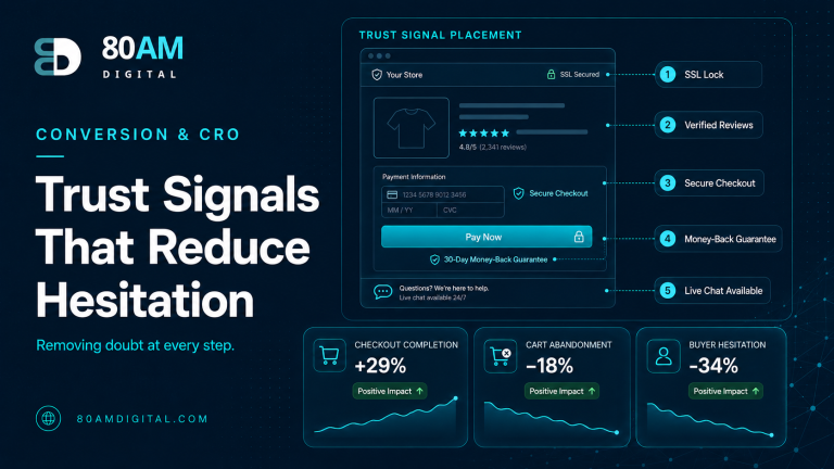
Below the primary CTA button: “No credit card required.” / “Takes 2 minutes.” / “We respond within one business day.” This is the risk-reduction layer immediately below the action. It answers the question “what am I committing to?” without requiring the visitor to scroll to find the answer in a FAQ section.
Above the phone field on contact forms: “We’ll only call if it’s relevant to your enquiry. Email always works too.” — Addresses the reluctance to share a phone number by naming the use case and offering the alternative. For many visitors, the phone field alone causes abandonment; microcopy that gives them control reduces that exit.
Placeholder text in form fields: Placeholder text disappears when the visitor starts typing, so it can’t carry essential information — use it only for format examples (“e.g. john@company.com”), not for field instructions. Field labels above the input carry the instruction; placeholder carries the example.
Error messages: “Invalid input” tells the visitor something went wrong; it doesn’t tell them what to fix. Error messages that specify the problem and the solution (“Please enter a valid email address — example: name@domain.com”) reduce re-submission friction and abandonment. Every error message should complete the sentence: “To fix this, [specific action].”
Confirmation and post-submission microcopy
The confirmation page or message after a form submission is the highest-stakes microcopy on most B2B sites — and the most neglected. Most confirmation messages say “Thank you! We’ll be in touch.” This leaves the visitor with three unanswered questions: when will you be in touch, by what channel, and what should I do in the meantime?
Effective confirmation copy: “Thank you — you’ll hear from us by email within one business day with next steps. In the meantime, these articles are the most relevant to your situation: [links].” This answers when (one business day), by what channel (email), and what to do now (read related content). It also re-engages the visitor rather than letting them leave.
Microcopy testing framework
Because microcopy changes are fast to implement and isolated to small elements, they’re good candidates for sequential testing even on sites that don’t have enough traffic for formal A/B tests. Change one piece of microcopy at a time, measure form completion rate or CTA click rate for two weeks, and compare. The cumulative effect of 6–8 sequential microcopy improvements often exceeds the impact of a single page redesign.
For what to test when you have the traffic volume for formal testing, see A/B testing with low traffic. For the broader conversion framework, see traffic but no conversions.
Where the highest-leverage fixes are
Small text, outsized effect
A worked example: six small changes
A B2B services site’s contact form had no microcopy anywhere: no reassurance under the email field, a required phone field with no explanation, a generic “Submit” button with nothing beneath it, and a confirmation page that read only “Thanks for reaching out!” Form completion rate sat at 11% of visitors who started the form, and a session-recording review showed several visitors hovering over the phone field for 10+ seconds before abandoning.
The team made six microcopy changes over six weeks, testing sequentially: a one-line privacy assurance under email, an explanation line above the now-optional phone field, “Takes 2 minutes — no sales call required” beneath the CTA, specific error messages replacing “Invalid input,” and a rewritten confirmation message stating the response window, the channel, and two relevant article links. Each change was measured for two weeks before the next was introduced. By the end of the six-week sequence, form completion rate had risen to 19% — without any redesign, new fields, or change to the offer itself.
Frequently asked questions
Answer the question before it’s asked
The best microcopy is invisible in the sense that it pre-empts hesitation so completely that the visitor never pauses. The worst microcopy is absent — leaving visitors with unanswered questions that cause them to leave. Audit your conversion flows for the questions visitors could plausibly ask at each step, and add the one-line answer in the right place. That’s the entire discipline in practice.
If you’d like a conversion copy review of your key pages, get in touch.