
How to Write a Homepage That Says What You Actually Do
Most homepages are too clever to be clear. Learn how to write a homepage that states what you do, for whom, and why—so visitors and AI both understand it.
Table of Contents
Most homepages say too little. Not in word count — they often say thousands of words. But they don’t answer the one question a visitor has in the first ten seconds: what does this company do, and is it for me?
The instinct to be clever, broad, or aspirational on the homepage is understandable. “We help businesses grow” feels more sophisticated than “We audit and improve the organic performance of e-commerce sites.” But clarity converts. Clever doesn’t.
This guide covers how to write homepage copy that answers the right questions in the right order — for the visitor who’s deciding whether to stay, and for AI systems that need to understand what your site is about before citing or recommending it.
The Short Version
- A homepage has to answer five questions in order: what do you do, who is it for, why does it matter, why you, and what do I do next.
- The headline pattern that works: [what you do] + [for whom] + [primary outcome] — clarity beats cleverness for conversion.
- A vague homepage gives AI systems nothing concrete to cite; an explicit one becomes a reliable entity signal, especially paired with Organisation schema.
- The homepage’s job is conversion from people who already know they’re in the right place — it shouldn’t be optimised to rank for competitive keywords.
The questions your homepage has to answer
In the order a visitor actually asks them:
| Question | Weak example | Strong example |
|---|---|---|
| 1. What do you do? | “We empower organisations” | “We audit and improve organic search performance” |
| 2. Who is it for? | “Businesses of all sizes” | “Sport and wellness brands selling direct” |
| 3. Why does it matter? | “More traffic” | “Traffic from searchers already looking to buy” |
| 4. Why you? | Generic claims of expertise | Specific proof, methodology, positioning |
| 5. What do I do next? | Multiple competing links | One clear, plainly stated action |
- What do you do? — Not in abstract terms. In specific terms. Not “we empower organisations” — “we audit and improve organic search performance.”
- Who is it for? — A visitor should be able to recognise themselves in your audience description. “Sport and wellness brands selling direct” is better than “businesses of all sizes.”
- Why does it matter? — What changes for the customer as a result of working with you? “More traffic” is weak. “Traffic from searchers who are already looking to buy” is the outcome that matters.
- Why you? — What makes your approach different from the next agency in the same category? This is where proof, methodology, and positioning live.
- What do I do next? — One clear action, stated plainly.
A homepage that answers all five questions, in that order, in plain language, will outperform one that’s more beautifully written but answers none of them directly.
Writing the headline
The headline’s only job is to answer question one — and ideally question two. It’s not for brand positioning or emotional resonance. It’s for clarity at first glance.
A useful test: read the headline as if you’ve never heard of the company. Can you state in one sentence what they do? If yes, the headline is working. If you need to read the paragraph below to understand it, the headline isn’t doing its job.
The headline pattern that consistently works: [What you do] + [for whom] + [primary outcome or differentiator].
For example: “Organic search strategy for sport and wellness brands that sell direct — focused on the fixes that move revenue, not traffic that doesn’t convert.” That’s 20 words that answer questions one, two, and three simultaneously.
Writing the subheadline
The subheadline expands on the headline — it doesn’t restate it. Its job is to add the most important piece of information the headline didn’t carry, or to address the first objection the headline likely raises.
If the headline stakes a claim (“the audit-first approach that gives you clarity before you commit to anything”), the subheadline delivers the mechanism or the proof (“A focused diagnostic of your technical health, content gaps, and conversion paths — prioritised by impact, not by what’s easiest to fix”).
The problem section: earning emotional buy-in
After establishing what you do, the homepage should show you understand what the visitor is experiencing. This isn’t a generic statement about industry challenges — it’s a specific, accurate description of the frustration or problem that brings someone to your service.
The more accurately you name the problem, the more quickly visitors trust that your solution is real. A description like “Most site audits produce a list of everything that could be better — then leave you to figure out what to do next” lands harder than “Navigating the complexity of modern SEO is challenging.”
The problem section doesn’t need to be long. Three to four sentences that name the specific friction the visitor feels, in language that sounds like something they would say rather than something from a marketing deck, is enough to earn the trust the offer section needs to close on.
Writing for AI as well as humans
AI systems read your homepage to understand what your business does — and use that understanding to decide when to cite or recommend you. A homepage that’s vague about what you do (“we help brands grow online”) gives AI systems nothing concrete to work with. A homepage that explicitly states your service, your audience, and your approach is extractable — AI can summarise your positioning accurately and recommend you to searchers who are looking for exactly what you offer.
Combine this with Organisation schema (which explicitly declares your business identity to AI systems) and the homepage becomes a reliable entity signal — not just for search engines, but for any AI that queries your site to understand what you are.
What clarity buys you
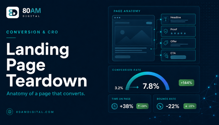
For more on conversion and page structure, see the seven most common conversion blockers and the landing page teardown.
A worked example: one rewrite, before and after
A B2B software company’s homepage opened with “Empowering teams to do their best work” above a hero image of people smiling around a laptop. Branded-search bounce rate sat at 68%, and direct-traffic conversion to a demo request was 0.8%.
The team rewrote the headline to “Project tracking for agencies that bill by the hour — see exactly where time is going, in real time,” replaced the lifestyle photo with a product screenshot showing a live time-tracking dashboard, and added a three-sentence problem section naming the specific frustration (“Most time-tracking tools tell you what happened last week. By the time you see the report, the budget’s already blown.”). No other page changed. Within six weeks, branded-search bounce rate fell to 51% and demo-request conversion rose to 2.3% — driven by visitors understanding what the product did and who it was for within the first screen, rather than scrolling to find out.
Frequently asked questions
Clarity is the conversion strategy
The homepage doesn’t need to sell your entire service. It needs to make visitors certain they’re in the right place and give them a clear reason to take the next step. Everything else — the detailed service breakdown, the case studies, the blog — is for people who’ve already decided to explore.
If you’d like a review of your homepage copy against the five questions above, get in touch — we’ll tell you where it’s losing visitors and what to change first.