
The 7 Most Common Conversion Blockers (and Quick Fixes)
Most pages lose conversions to the same few issues. Here are the seven most common conversion blockers and the quick fixes that recover lost leads and sales.
Table of Contents
Most pages don’t fail to convert because of one catastrophic problem. They fail because of a cluster of small, fixable issues — each one reducing the percentage of visitors who take the next step. Remove a few of them and the conversion rate moves, often significantly, without a full redesign.
These are the seven conversion blockers that appear most consistently across service pages, landing pages, and high-intent content pages. Each one has a clear fix that doesn’t require a developer.
The Short Version
- Seven recurring blockers: outcome-less headlines, buried offers, vague proof, bloated forms, generic CTA copy, no risk reduction, and slow mobile load.
- None of these require a developer or a redesign — each has a copy-level or settings-level fix that can ship the same day.
- Diagnose with scroll-depth and click data before fixing — match the fix to where visitors are actually dropping off, not to what’s easiest to change.
- Fix blockers before adding traffic — more visitors to a page with these issues just produces more people failing to convert.
The table below summarises all seven before the detail on each:
| Blocker | Quick fix |
|---|---|
| 1. Outcome-less headline | Rewrite around the result the visitor gets, not the service category |
| 2. Buried offer | State the offer in the first screen; repeat the CTA 2-3 times down the page |
| 3. Vague proof | Replace generic claims with 1-2 specific, attributable proof points |
| 4. Too many form fields | Cut to name, email, and one open field |
| 5. Generic CTA copy | Replace “Submit” with copy that completes “I want to ___” |
| 6. No risk reduction | Add a one-line reassurance statement beneath the CTA |
| 7. Slow on mobile | Fix the top 3-5 issues flagged by PageSpeed Insights |
1. The headline describes the product, not the outcome
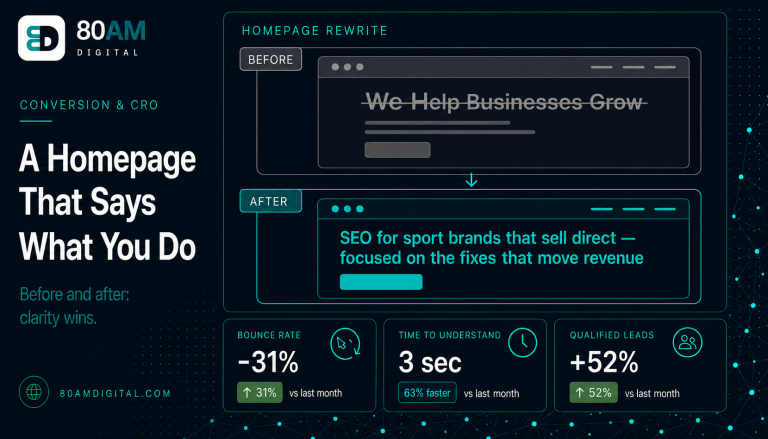
The most common conversion blocker on service pages: the headline announces what you offer rather than what the visitor gets. “Comprehensive SEO Services” describes a product. “More organic traffic, fewer wasted months” describes a result.
Quick fix: Rewrite the headline around the primary outcome the visitor cares about, not the service category. Test the new headline by asking: does a visitor who knows nothing about SEO understand why this matters to them? If yes, it’s communicating an outcome. If no, it’s still describing a product.
2. The offer is buried
Many pages make visitors work to understand what they’re being asked to do. The CTA appears only at the bottom. The deliverable (what exactly they get) isn’t stated clearly above the fold. The value proposition requires reading through three paragraphs to extract.
Quick fix: The primary offer — one sentence describing what the visitor gets and what happens next — should appear within the first screen. The CTA should appear at least twice: once above the fold (or close to it) and once at the end. If the page is long, a third CTA midway through the content is appropriate.
3. Proof is missing or unspecific
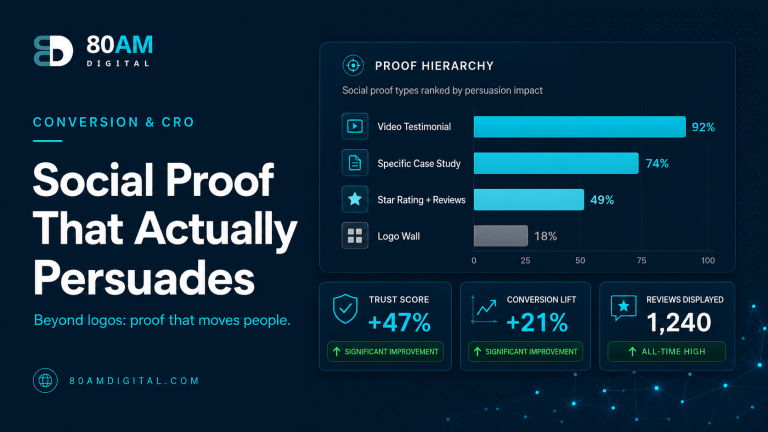
Social proof that consists only of “hundreds of satisfied clients” or “trusted by businesses across the UK” carries no weight — it’s unverifiable and indistinct. Specific proof is what builds credibility: named clients, specific results, before-and-after data, or direct quotes with attribution.
Quick fix: Replace any generic credibility claims with one or two specific, attributable proof points. A single quote from a named client saying “Traffic doubled within four months” outperforms a page full of vague testimonials. If you don’t have testimonials yet, specific results (“3 clients in the sport and wellness sector”) are better than nothing.
4. The form has too many fields
Every additional field in a contact or lead generation form reduces completion rate. Most forms ask for information the business wants, not information needed to begin the conversation. Company size, industry, annual revenue, marketing budget — most of this can be determined from the initial conversation, not a form.
Quick fix: Reduce the form to the minimum required to respond meaningfully. For most service businesses, that’s: name, email, and one open field (“Tell us about your site or situation”). Every field removed from a long form improves completion rate, usually by more than expected.
5. The CTA copy is generic
“Submit,” “Contact Us,” and “Get Started” are the most common CTA labels on service pages — and the least motivating. They describe an action but communicate no value. A visitor about to hesitate gets no additional reason to click.
Quick fix: Rewrite the CTA label to reflect what the visitor gets by clicking: “Request your free audit,” “Send us your site,” “Get the plan.” The label should complete the sentence “I want to ___.” Generic verbs like “Submit” complete no such sentence for a visitor on the fence.
6. No risk reduction near the CTA
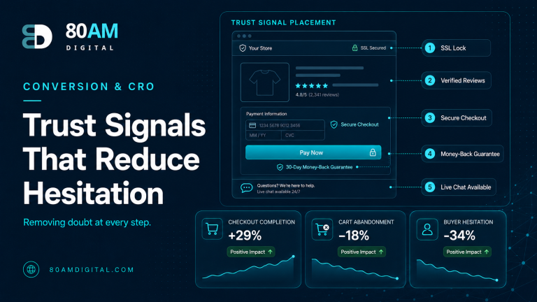
The moment before clicking a CTA is when objections are loudest: Is this a commitment? Will someone call me immediately? Do I have to pay upfront? A CTA sitting alone without any reassurance answers none of these questions — and some visitors leave rather than find out.
Quick fix: Add a short risk-reduction statement beneath the CTA. “No retainer required. We’ll respond within one business day.” Or “No commitment — we’ll send you a plan and you decide whether to continue.” Two sentences that address the most common friction point for a visitor who is ready but uncertain.
7. The page is slow on mobile
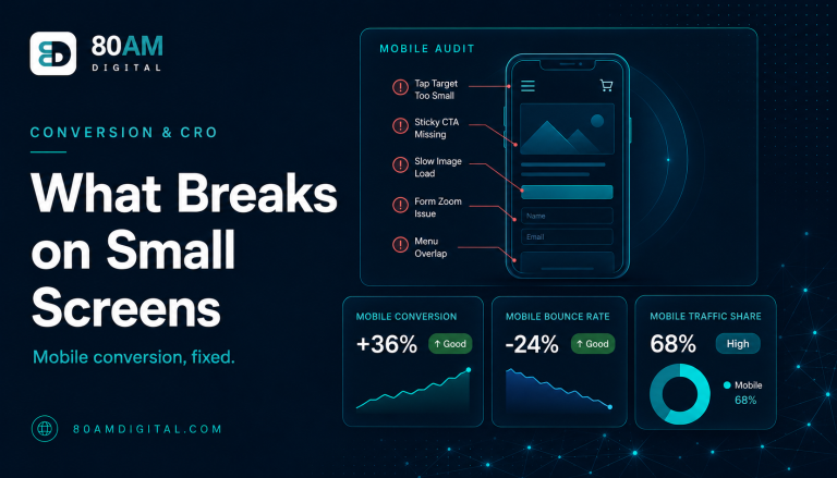
A page that loads slowly doesn’t give most users the chance to convert — they’ve already left. Mobile page speed directly affects conversion rate: studies consistently show that every additional second of load time reduces conversions by 4–8% on average. For pages receiving organic traffic, slow mobile load times are particularly damaging because mobile accounts for the majority of search traffic.
Quick fix: Run the page through Google PageSpeed Insights and fix the specific issues it flags — usually large uncompressed images, render-blocking scripts, and fonts without size declarations. Addressing the top three to five issues flagged by PageSpeed typically produces the largest speed improvement for the least work. For more detail, see how to fix Core Web Vitals.
For a deeper diagnosis of why traffic isn’t converting across your site, see traffic but no conversions: a page-by-page diagnosis and the landing page teardown.
A worked example: fixing four blockers in one pass
Same traffic, four copy-level fixes
A B2B audit landing page was converting at 2.1% with a headline reading “Professional SEO Audit Services,” a seven-field contact form (name, email, company, role, company size, budget, timeline), a “Submit” button, and no statement of what happened after submission. Four changes were made in a single afternoon: the headline became “Find out exactly what’s holding your traffic back,” the form was cut to name, email, and “what’s the main issue you’re seeing,” the button became “Get my audit,” and a line reading “No sales call required — we’ll send the audit by email within 2 business days” was added beneath it.
No other section of the page changed, and no design work was commissioned. Over the following five weeks, conversion rate on the same paid and organic traffic rose to 3.8% — driven entirely by removing friction at four specific points, each identified from the checklist above.
Frequently asked questions
Fix the blockers before adding more traffic
More traffic to a page with conversion blockers produces more people failing to convert. The highest-leverage sequence is to diagnose and fix the blockers first — then invest in driving more traffic to a page that actually converts it.
If you’d like a structured review of which pages on your site have the highest conversion potential and the fastest wins available, see how we approach conversion and page improvement.