
Landing Page Teardown: Anatomy of a Page That Converts
We break down a high-converting landing page section by section—headline, proof, offer and CTA—so you can apply the same anatomy to your own pages.
Table of Contents
Most landing pages don’t fail because of bad design. They fail because the structure is wrong — the headline is doing the wrong job, the proof shows up too late, or the CTA appears before the visitor has a reason to click it.
This teardown breaks down a high-converting landing page section by section — not to show off one specific page, but to explain what each section has to accomplish and why the order matters as much as the copy.
By the end, you’ll have a working template you can apply to any page on your site that needs to earn a conversion.
The Short Version
- High-converting pages answer the visitor’s questions in the order they actually have them: what is this, is it for me, does it work, what do I do next.
- Eight sections each have one job — headline, subheadline, hero visual, proof strip, problem block, offer, objection handling, CTA — and each sets up the next.
- Most pages fail two or three of the eight checks, and those failures are usually fixable with copy changes, not a redesign.
- Fix in order of where visitors actually drop off (scroll depth and click data), not in order of what’s easiest to change.
Why anatomy matters more than aesthetics
Design gets blamed for low conversion rates more than it deserves. A page that looks clean but buries the value proposition doesn’t convert — not because of bad visuals, but because the structure asks the visitor to do too much work.
High-converting pages share a pattern: they answer the visitor’s questions in the order the visitor actually has them. What is this? Is it for me? Does it work? What do I do next?
That’s the anatomy. Get the sequence right and most other things can be optimized later. Get it wrong and no amount of A/B testing fixes the underlying problem.
The eight sections — and what each one has to do
| Section | Job | What breaks it |
|---|---|---|
| 1. Headline | Is this for me? | Leading with product/company name instead of outcome |
| 2. Subheadline | Add specificity to the promise | Restating the headline in different words |
| 3. Hero visual | Make the headline more believable | Generic stock photo that distracts from the claim |
| 4. Proof strip | Are other people taking this seriously? | Buried at the bottom, or inflated/unverifiable claims |
| 5. Problem block | Show you understand the pain | Naming a problem so generic it applies to anyone |
| 6. Offer section | What do they actually get? | Describing the process without the output |
| 7. Objection handling | Resolve the “buts” before they leave | Assuming the offer speaks for itself |
| 8. CTA | Make the action obvious | Multiple competing CTAs causing choice paralysis |
1. The Headline: One Job Only
The headline answers: What is this, and is it for me?
It doesn’t have to be clever. It doesn’t have to list every feature. It has to communicate the primary outcome the visitor gets — in language close enough to what they were thinking when they arrived that they feel like they’re in the right place.
What breaks this section: headlines that lead with the product name or company name, headlines built around internal jargon, or headlines that describe a feature instead of an outcome.
What works: “Find what’s limiting your traffic — before you commit to anything” outperforms “Our Comprehensive SEO Platform” every time. One makes a promise; the other describes a product.
2. The Subheadline: Expand, Don’t Repeat
The subheadline’s job is to add specificity to the promise the headline just made. This is where you can introduce the mechanism — how you deliver the outcome — or address the most common objection the visitor is already forming.
What breaks this section: restating the headline with different words, being vague to the point of being meaningless (“We help businesses grow”).
What works: “A focused review of your site’s technical SEO, content, and conversion paths — ranked by what will actually move performance.” That adds information the headline didn’t carry.
3. The Hero Visual: Reinforce, Don’t Distract
The hero image or visual has one job: make the headline more believable or more concrete. A screenshot of a dashboard showing results, a before/after comparison, or a simple product-in-use image all do this. A generic stock photo of a handshake does the opposite — it creates cognitive distance between the promise and the evidence.
What works: for service pages, a UI mockup or diagnostic preview is more persuasive than any lifestyle photo. Show the work, not the feeling of the work.
4. The Proof Strip: Establish Who Trusts You
Just below the hero is where most high-converting pages insert a short trust signal — brand logos, a single strong stat, or a one-line quote. This isn’t the main testimonial section. It’s a fast credibility checkpoint: are other people taking this seriously?
What breaks this section: putting it at the bottom of the page, where skeptical visitors never reach it. Or inflating it with unverifiable claims (“Trusted by 10,000+ businesses”).
What works: three to five recognizable logos or a short, specific quote from a real client. Specificity is the credibility signal — not scale.
5. The Problem/Solution Block: Show You Understand the Pain
This is where most pages skip straight to the offer and lose the visitor. Before someone cares about your solution, they need to feel like you understand their problem accurately.
This section names the friction the visitor is experiencing — not in abstract terms, but in language that mirrors how they describe it themselves. Then it frames your offer as the natural resolution.
What breaks this section: being so general that the problem could apply to anyone (“Struggling to grow online?”). That’s the same as not naming the problem at all.
What works: “Most site audits produce a list of everything that could be better — then leave you to figure out what to fix first. The diagnostic-first approach exists because sequencing matters as much as the list.” Specific, familiar, and immediately contrasted with the alternative.
6. The Offer Section: What They Actually Get
This is where you explain the deliverable — not the philosophy, not the process in abstract, but the tangible output the visitor receives. What is it? What does it cover? What will they be able to do after?
What breaks this section: describing the method without the output (“We’ll conduct a thorough analysis”). Analysis of what? Resulting in what?
What works: structured scope bullets that name specific outputs. “A prioritised list of fixes, ranked by impact. A section-by-section breakdown of your top five pages. A clear next step, whether or not you continue with us.” Concrete, sequenced, bounded.
7. Objection Handling: Address the Buts
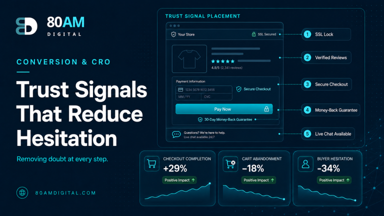
Every visitor arrives with objections forming in the background. The page’s job is to name and resolve them before the visitor uses them to leave. FAQ sections, side-by-side comparisons, and risk-reversal statements (money-back guarantees, no-commitment framing) all serve this function.
Common objections on service pages: Is this a long commitment? Will it just be a generic audit? Do you work with companies my size? Will I have to manage this?
What works: addressing these directly, in plain language, without over-explaining. “Most engagements start with a focused audit — not a retainer. The audit tells us what the site actually needs before anyone commits to ongoing work.” That resolves the lock-in objection in two sentences.
8. The CTA Section: Make the Action Obvious
The CTA section restates the primary offer and makes the next step frictionless. One action. One button. Optional reinforcement of why now.
What breaks this section: multiple competing CTAs (“Start a trial | Book a call | Download the guide | Learn more”). Giving someone four options is the same as giving them none — choice paralysis is real, and at the decision point it’s deadly.
What works: one clear action, a short restatement of what they get by taking it, and a micro-commitment reducer underneath (“No retainer required. Reply within one business day.”).
The thing most teardowns miss: the connective tissue
Each section above has a job — but the page doesn’t convert because each section is good. It converts because each section sets up the next one.
The headline creates curiosity. The subheadline resolves that curiosity with specificity. The proof strip intercepts the skepticism that specificity might trigger. The problem block earns emotional buy-in before the offer is even introduced. The offer section satisfies the rational evaluation. Objection handling clears the last friction. The CTA closes the loop.
Remove any one of those links and the chain breaks. Add a section out of order and the visitor loses the thread.
This is why redesigns that improve individual sections without fixing the sequence often don’t move conversion rates. The issue was never the copy in isolation — it was the order.
How to apply this to your own pages
Run your highest-traffic, lowest-converting pages through this checklist:
- Headline: Does it name an outcome in the visitor’s language — or a product in your language?
- Subheadline: Does it add new information — or restate the headline?
- Hero visual: Does it show the work or the outcome — or a stock photo that could belong to any company?
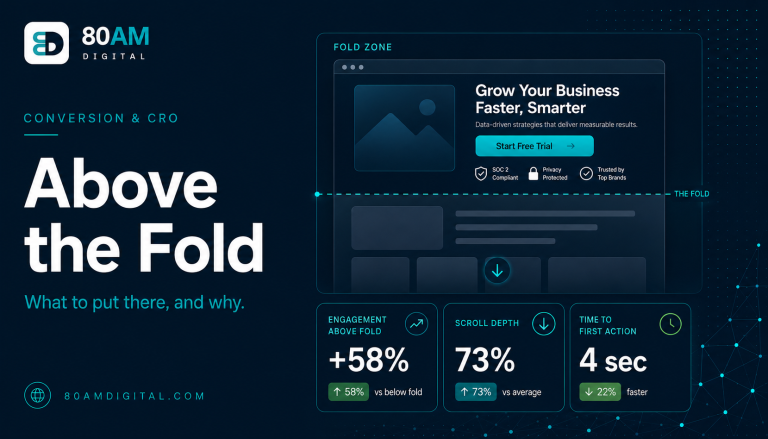
- Proof strip: Is it above the fold, or buried at the bottom where skeptical visitors never reach it?
- Problem block: Do you name a specific pain — or a generic frustration that applies to everyone?
- Offer section: Do you list concrete deliverables — or describe a process without an output?
- Objection handling: Do you address the three most common reasons visitors don’t act — or assume the offer speaks for itself?
- CTA: Is there one clear action — or multiple competing options?
Most pages fail two or three of these — and those failures are almost always fixable with copy changes, not redesigns.
What usually fixes the most, fastest
A worked example: one headline, before and after
A B2B services company’s landing page headline read “Comprehensive Digital Marketing Solutions for Growing Businesses” — product language, no outcome, no specificity. The page converted at 1.4% against paid traffic that cost roughly $40 per click.
Applying the anatomy checklist surfaced three failures: the headline named a category, not an outcome; the proof strip was placed below the offer section rather than near the top; and the CTA section had three competing buttons (Book a Call, Get a Quote, Learn More). The team rewrote the headline to “Find the three things slowing down your pipeline — in one 45-minute call,” moved the proof strip above the problem block, and cut the CTA to a single button. No other section changed and no redesign was commissioned. Conversion rate on the same paid traffic rose to 3.1% over the following six weeks — more than double, from sequencing and copy changes alone.
Frequently asked questions
What to do next
If your highest-traffic pages aren’t converting the way they should, the structure is usually worth examining before the copy. Most of the fixes in this teardown take hours, not weeks — and they compound: a better headline means more qualified visitors stay, which means the proof section gets to do its job, which means more of them reach the CTA.
If you’d like a second set of eyes on a specific page — or want to understand where your site is losing conversions before you commit to any changes — see how we approach page improvement or get in touch.