
Mobile Conversion: Why the Gap Exists and How to Close It
Most organic traffic is mobile, but most conversions happen on desktop. The gap isn’t screen size — it’s friction. Here’s where mobile conversion breaks and how to fix it.
Table of Contents
For most websites with organic traffic, the data looks the same: mobile accounts for 55–70% of sessions, but desktop accounts for 65–75% of conversions. The mobile conversion rate gap — typically 2–4x lower than desktop — is so consistent that many businesses have stopped treating it as a problem to solve and started treating it as a structural fact. It isn’t. The gap is real, but most of it is caused by solvable friction problems, not by mobile visitors being fundamentally less likely to buy.
Part of the gap is legitimate: research happens on mobile, decisions happen on desktop, particularly for high-consideration B2B purchases. But the majority of the gap for most sites is friction — mobile experiences that are harder to use, slower to load, and worse at answering buyer questions than their desktop equivalents.
The Short Version
- Most of the mobile conversion gap is friction, not a structural fact — page speed, form friction, CTA visibility, and readability are the usual culprits.
- Conversion rate drops roughly 4.42% per additional second of mobile load time between 0 and 5 seconds — speed alone can explain a large share of the gap.
- A sticky CTA and click-to-call capture mobile intent that a static, form-only desktop-style flow misses entirely.
- Part of the gap is legitimate cross-device behaviour (research on mobile, purchase on desktop) — check GA4’s cross-device paths before assuming it’s all friction.
Where mobile conversion breaks
| Friction source | Why it hits mobile harder |
|---|---|
| Page speed | Slower connections; conversion drops ~4.42% per extra second (0-5s) |
| Form friction | Small tap targets and mismatched keyboards on touchscreens |
| CTA visibility | Smaller above-fold area pushes the CTA out of the first screen |
| Content readability | Tables/multi-column layouts that don’t reflow break trust |
Page speed: Mobile devices are typically on slower connections than desktop. A page that loads in 1.8 seconds on a home broadband connection may take 4–6 seconds on a 4G connection mid-commute. Google’s data shows conversion rates drop 4.42% per additional second of load time between 0 and 5 seconds. For many sites, mobile page speed is the single largest driver of the conversion gap. Check the mobile PageSpeed Insights score and address the Core Web Vitals failures for mobile specifically — they’re often different from desktop failures.
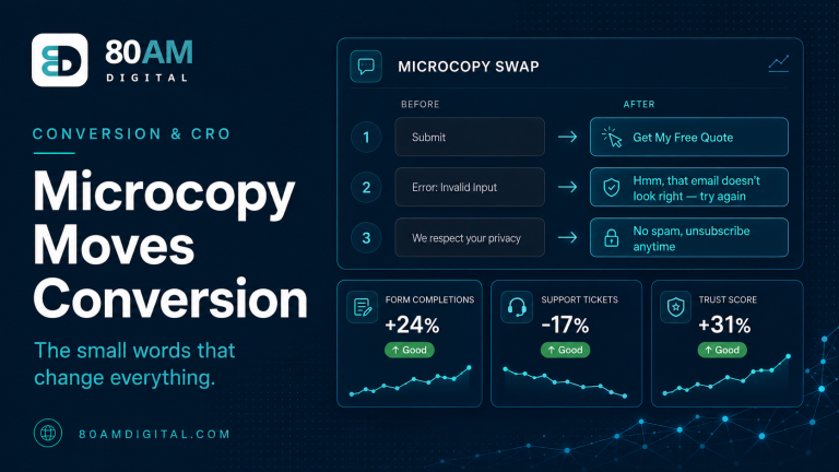
Form friction: Forms that work reasonably on desktop can be painful on mobile. Tap targets that are too small (under 44×44px), keyboard types that don’t match field types (a numeric phone field that opens the text keyboard, not the dial pad), scrolling required to find the submit button, long forms that require more vertical scrolling than a desktop user would tolerate. Each friction point has a disproportionate effect on mobile conversion because the input method (touchscreen) is inherently less precise and more effortful than desktop keyboard/mouse.
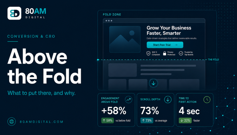
CTA visibility: On mobile, the above-fold area is smaller than desktop. A CTA that appears in the lower third of the desktop hero may be entirely below the fold on mobile, requiring a scroll that many visitors won’t take. Check every key page in Chrome’s mobile device simulation and confirm the headline, subheadline, and primary CTA are all visible on the first screen on iPhone SE (the smallest common screen in active use, at 375×667px).
Content readability: Text that’s readable on desktop (14px, comfortable line length) may be too small or too wide on mobile. Tables, comparison charts, and multi-column layouts that look fine on desktop often break on mobile — columns that are too narrow to read, tables that require horizontal scrolling. These don’t directly stop conversion, but they signal a low-quality experience and reduce the trust that drives conversion.
Mobile-first conversion improvements
Sticky CTA button on mobile: A fixed-bottom CTA button that remains visible as the visitor scrolls eliminates the problem of CTA visibility on long pages. On mobile, this converts significantly better than a CTA that’s only visible at the bottom of a long page — the visitor who reads halfway down and is ready to act doesn’t have to scroll back to the top or all the way to the bottom to find the button.
Click-to-call as a conversion path: On mobile, a phone call is one tap away. For service businesses where phone enquiries are a primary conversion path, a click-to-call button (and tracking it as a GA4 conversion event) captures mobile intent directly. Many mobile visitors would rather call than fill in a form — the form exists for visitors on desktop who prefer not to call. Both paths should be visible and easy on mobile.
Simplified mobile forms: For forms on mobile-heavy landing pages, consider a shorter mobile form (name + phone for a call-back) vs the full desktop form. Progressive web apps and some landing page builders allow device-specific form configuration.
For the technical performance improvements that affect mobile load speed, see Core Web Vitals. For the form friction framework, see form friction and lead quality.
The mobile gap in numbers
What the typical site is leaving on the table
A worked example: closing the gap on one landing page
A home services company’s quote-request landing page converted at 1.1% on mobile against 3.9% on desktop, despite mobile driving 64% of sessions. Mobile PageSpeed Insights flagged a 5.8-second Largest Contentful Paint, the form had no input-type attributes (so the phone field opened the full text keyboard), and the CTA sat below a tall hero image that pushed it off the first screen on most phones.
The team compressed the hero image and removed a render-blocking script (cutting LCP to 2.4 seconds), added correct input types to the form, shortened the mobile-specific form to three fields, and added a sticky “Get My Quote” bar with a click-to-call icon. No desktop changes were made. Over the following month, mobile conversion rate rose to 2.6% — still below desktop, but the gap closed from 3.5x to roughly 1.5x, and the page’s overall conversion volume rose meaningfully given that mobile carried the majority of traffic.
Frequently asked questions
Treat mobile as the primary experience
Most organic traffic is mobile. Most conversion optimisation work happens on desktop. The gap between these two facts explains a large part of the mobile conversion gap itself. Audit your key conversion pages on a real mobile device, not just in Chrome’s device simulation. Find the friction that wouldn’t be obvious on desktop. Fix the top two or three issues and measure the impact before optimising further. The mobile conversion rate gap is real — but on most sites, a significant portion of it is self-inflicted friction that’s cheaper and faster to fix than it looks.
If you’d like a mobile conversion audit as part of a broader CRO review, get in touch.