Above the Fold: What to Put There and Why
The top of the page decides whether visitors stay. Learn what belongs above the fold — headline, value, proof and CTA — and what to push down the page.
Table of Contents
Visitors decide in the first 5–10 seconds whether to stay on a page. That decision is made entirely from what’s visible without scrolling — the “above the fold” region. If that region doesn’t tell visitors what the page is, why it matters to them, and what to do next, they leave. The rest of the page — the detailed benefits section, the case studies, the FAQs — never gets seen.
Above the fold is not a design problem. It’s a clarity problem. The question it has to answer in 5 seconds: am I in the right place?
The Short Version
- Above the fold needs exactly four things: a specific headline, a detail-adding subheadline, a visible CTA, and one proof element.
- Auto-playing video, busy navigation, generic stock photos, and long intro paragraphs all crowd out the four things that actually need to be there.
- Mobile is the priority version — design to fit the headline, value statement, and a CTA within roughly 667-844px on the smallest common screens.
- Diagnose with bounce rate, scroll depth, and above-fold CTA click rate — each points to a different part of the section that’s failing.
What belongs above the fold
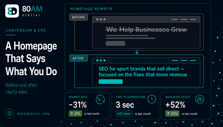
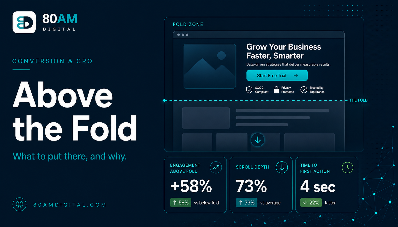
A headline that says what you do: Not aspirational, not vague, not brand-speak. “We help businesses grow” is not a headline — it’s a placeholder. “SEO and conversion strategy for sport and wellness brands” is a headline. It tells the visitor exactly what is offered and who it’s for. If the visitor has to read the paragraph below the headline to understand what the company does, the headline is failing.
A subheadline that adds the most important detail the headline didn’t carry: The headline establishes what and for whom. The subheadline adds the most important how or why — the one differentiating fact that makes the offer more compelling than the alternatives the visitor has already encountered.
A visible CTA: The primary action the visitor should take if they’re ready to act. Not hidden below the fold, not requiring them to read more before they can find it. Many visitors who are already warm (referred, already researched) want to act immediately — the above-fold CTA captures them before they scroll past.
One proof element: A single trust signal that makes the claim in the headline more credible. A recognisable client logo, a specific result stat (“47 brands served, average 3.2x organic growth in 12 months”), a media mention, or a star rating. One element is enough above the fold; the detailed proof block belongs further down.
What doesn’t belong above the fold
| Element | Why it crowds out the four essentials |
|---|---|
| Auto-playing video/animation | Slows the page, distracts from copy, hurts LCP and Core Web Vitals |
| Navigation with 8+ links | Competes with the headline for attention, invites early exit |
| Generic stock photography | Adds no clarity, takes visual space copy could use better |
| Long introductory paragraphs | Above-fold should be scannable in under 5 seconds, not read |
- Auto-playing video or animated backgrounds: These slow the page, distract from the copy, and rarely communicate anything faster than well-written text. They also directly affect LCP (Largest Contentful Paint), hurting Core Web Vitals.
- Navigation with too many options: A navigation bar with 8 links above the fold competes with the headline for attention and invites visitors to leave before they’ve read anything.
- Generic stock photography: A hero image of smiling people at laptops or abstract corporate imagery adds nothing to the clarity of the offer and takes significant visual space that copy could occupy more usefully.
- Long introductory paragraphs: Body text that takes 60 words to set up what the company does belongs in the second section, not above the fold. The above-fold region should be scannable in under 5 seconds.
Above the fold on mobile
Mobile above-the-fold is a smaller area than desktop — typically showing less text and fewer elements. Check every page’s mobile above-the-fold in Chrome’s device simulation. Common issues: the headline is too large and wraps to take up the entire visible area, pushing the subheadline and CTA below the fold; the navigation takes 80px of space that could be used for copy; or the hero image is so tall on mobile that the headline appears below it.
Since mobile-first indexing means Google evaluates your mobile version, and since most organic search happens on mobile, the mobile above-the-fold is the priority version to optimise.
For the homepage specifically, see how to write a homepage that says what you actually do. For landing pages, see the landing page teardown.
The above-fold checklist at a glance
Five seconds, four elements
A worked example: cutting one hero section in half
A consulting firm’s homepage hero contained a full-width video background, an 80-word introductory paragraph, a navigation bar with 9 links, and a CTA that only appeared after scrolling past the video. Mobile bounce rate from organic traffic was 71%, and scroll-depth data showed most mobile visitors never reached the 25% mark.
The team removed the video, cut the navigation to 5 links, replaced the 80-word paragraph with a 12-word subheadline, and moved the CTA into the first screen. The redesigned hero fit a headline, subheadline, CTA, and one client-logo proof strip into roughly 700px on mobile. Within a month, mobile bounce rate fell to 54% and scroll depth past 25% rose by 22 percentage points — visitors were staying because the first screen finally answered “am I in the right place?” without requiring a scroll.
Frequently asked questions
Five seconds to answer the right question
The above-fold region isn’t about design preferences — it’s about answering “am I in the right place?” before the visitor decides to leave. A clear headline, a supporting subheadline, a visible CTA, and one proof element are all it takes. Everything else belongs below.
If you’d like a review of your above-the-fold section against this framework, get in touch.