How to Build an SEO Dashboard in Looker Studio
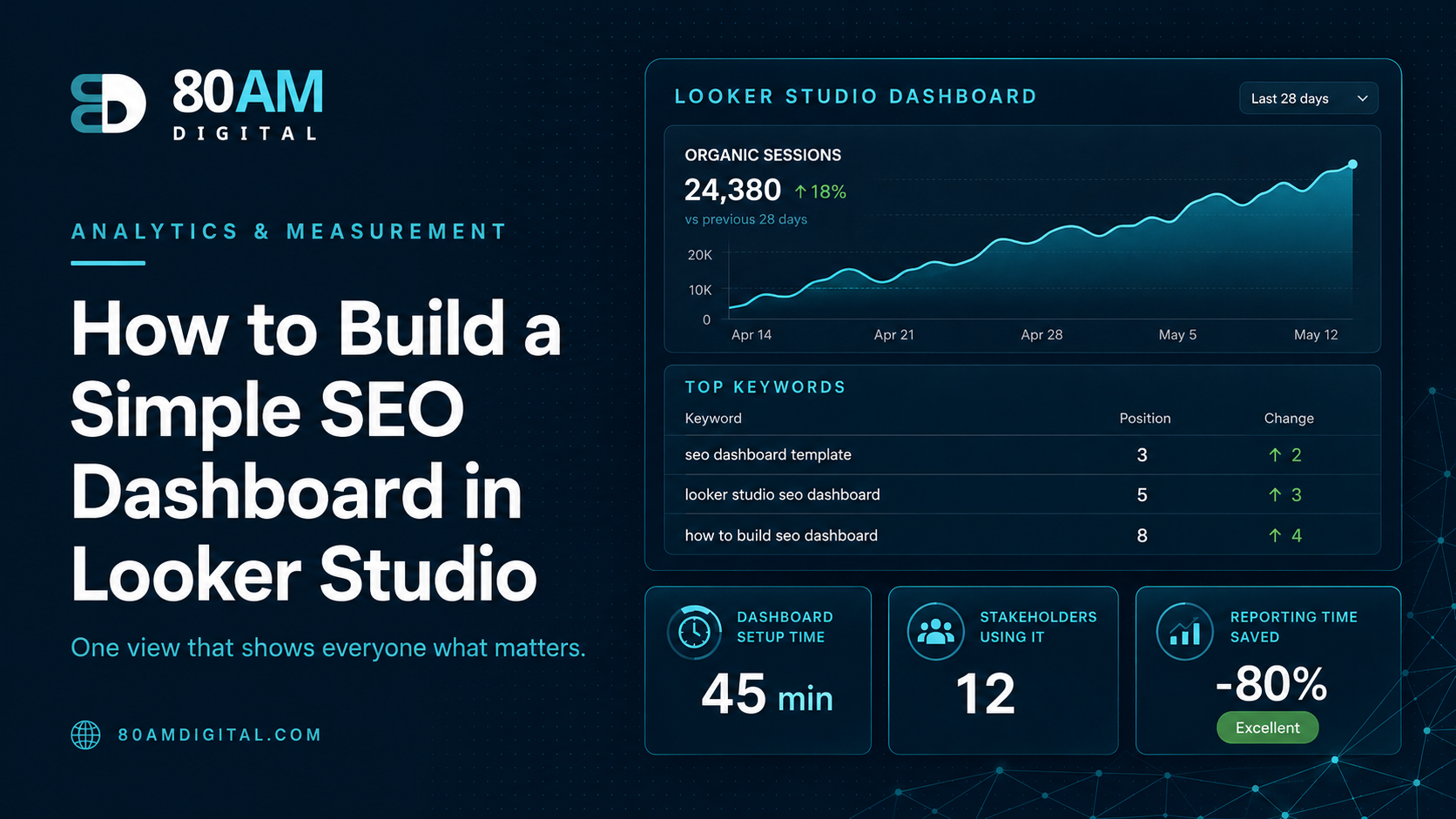
A good SEO dashboard shows progress toward outcomes, not just traffic. Learn how to connect Search Console and GA4 in Looker Studio to build a dashboard that matters.
Most SEO dashboards show the wrong things. Traffic is up, rankings are up, impressions are up — but the business doesn’t know why that matters or what to do about it. A useful SEO dashboard connects organic search performance to business outcomes (leads, revenue, pipeline) and shows the leading indicators that predict whether those outcomes will improve or decline.
Looker Studio (formerly Google Data Studio) is free, connects natively to Search Console and GA4, and can be shared as a live report with stakeholders. Here’s how to build one that tells the story your business actually needs, including a worked example of what a dashboard rebuild surfaced for one team that had been flying blind.
The Short Version
Connect Search Console and GA4 as separate data sources in Looker Studio, then build five views: an executive summary, keyword and ranking trends (branded vs non-branded), landing page performance with conversion rate, technical health indicators (Core Web Vitals, index coverage), and content performance for recently published pages. Search Console data only goes back 16 months in Looker Studio — export to BigQuery if you need a longer history. The test of a good dashboard: a stakeholder should understand whether organic is working in under 5 minutes.
Table of Contents
Connecting Your Data Sources
In Looker Studio: Create → New Data Source → Google Search Console. Connect your Search Console property. Repeat for GA4: Create → New Data Source → Google Analytics 4 → select your GA4 property. You’ll use both data sources in the same report — Search Console for keyword and ranking data, GA4 for session and conversion data.
Note: Search Console data in Looker Studio is limited to the previous 16 months. For longer trend data, use the Looker Studio’s date range controls rather than absolute date comparisons, and export historical Search Console data to BigQuery if you need it beyond 16 months.
The Five Views Every SEO Dashboard Needs
| View | Data source | Answers |
|---|---|---|
| 1. Executive summary | GA4 + Search Console | Is organic up or down, and does it matter? |
| 2. Keyword and ranking trends | Search Console | Which keywords are driving or losing traffic? |
| 3. Landing page performance | GA4 | Which pages convert, which just attract clicks? |
| 4. Technical health indicators | Search Console | Are there early-warning signs of a future drop? |
| 5. Content performance | GA4 + Search Console | Is new content actually working? |
1. Executive summary (single page, at-a-glance): Organic sessions (GA4, month over month and year over year), organic conversions (GA4, same periods), average position for top 20 branded and non-branded queries (Search Console), impressions and clicks year over year (Search Console). Date range selector at the top so stakeholders can adjust the window. This view should answer “is organic search up or down this period and does it matter?” in under 30 seconds.
2. Keyword and ranking trends: A table from Search Console showing queries by clicks, with columns for impressions, CTR, average position, and period-over-period change in position. Filter to exclude branded queries for the primary view; create a separate filter for branded query performance. Sorted by clicks descending. This view identifies which keywords are driving traffic and which are losing ground.
3. Landing page performance: GA4 data showing top organic landing pages by sessions, with organic conversion rate per page and goal completions. This identifies which pages are driving traffic but not converting and which pages are high-conversion but low-traffic (opportunities for more organic promotion or link building).
4. Technical health indicators: Core Web Vitals status (from Search Console’s Core Web Vitals report via the API), index coverage (total indexed pages vs total pages submitted), and crawl stats if available. These are the early-warning indicators that predict future ranking changes — a crawl budget issue that isn’t tracked now shows up as a traffic drop in 3 months.
5. Content performance: New pages published in the period (GA4 or manual annotation), ranking velocity for recently published content (Search Console filtered by page, date range set to the publication period), and pages that have moved significantly up or down in average position. This view shows whether the content programme is working.
For what to put in the executive summary specifically, see reporting SEO to executives. For how to forecast the numbers on the dashboard, see how to forecast SEO results.
A Worked Example
A mid-sized SaaS company had a Looker Studio dashboard with eleven tabs, built over two years by different team members each adding their own view. Nobody outside the SEO team opened it regularly, and the quarterly executive update was put together manually in slides because the dashboard itself was considered “too much” to share directly.
The team rebuilt it from scratch using the five-view structure above, starting with a single executive summary page and treating the other four as supporting detail accessible via tabs but not required reading. Building the landing page performance view for the first time surfaced something the eleven-tab version had buried: three of the highest-traffic blog pages had a 0% organic conversion rate against a site average of 2.3%, despite ranking well and earning solid traffic for over a year.
That single view — not present in any useful form in the old dashboard — led directly to a CTA redesign on those three pages. More importantly, the simplified dashboard started getting opened by the head of marketing without anyone prompting them, because it finally answered the question they actually had in under five minutes rather than requiring a guided tour.
Frequently Asked Questions
A Dashboard That Earns Its Attention
The test of an SEO dashboard: can a stakeholder with 5 minutes look at it and understand whether organic search is performing well, why, and what should happen next? If it requires interpretation or produces as many questions as answers, it needs simplification. Start with the executive summary view and build additional views only if stakeholders ask for more detail — don’t add complexity to prove thoroughness.
If you’d like a Looker Studio SEO dashboard template or help setting up your organic search reporting, get in touch.